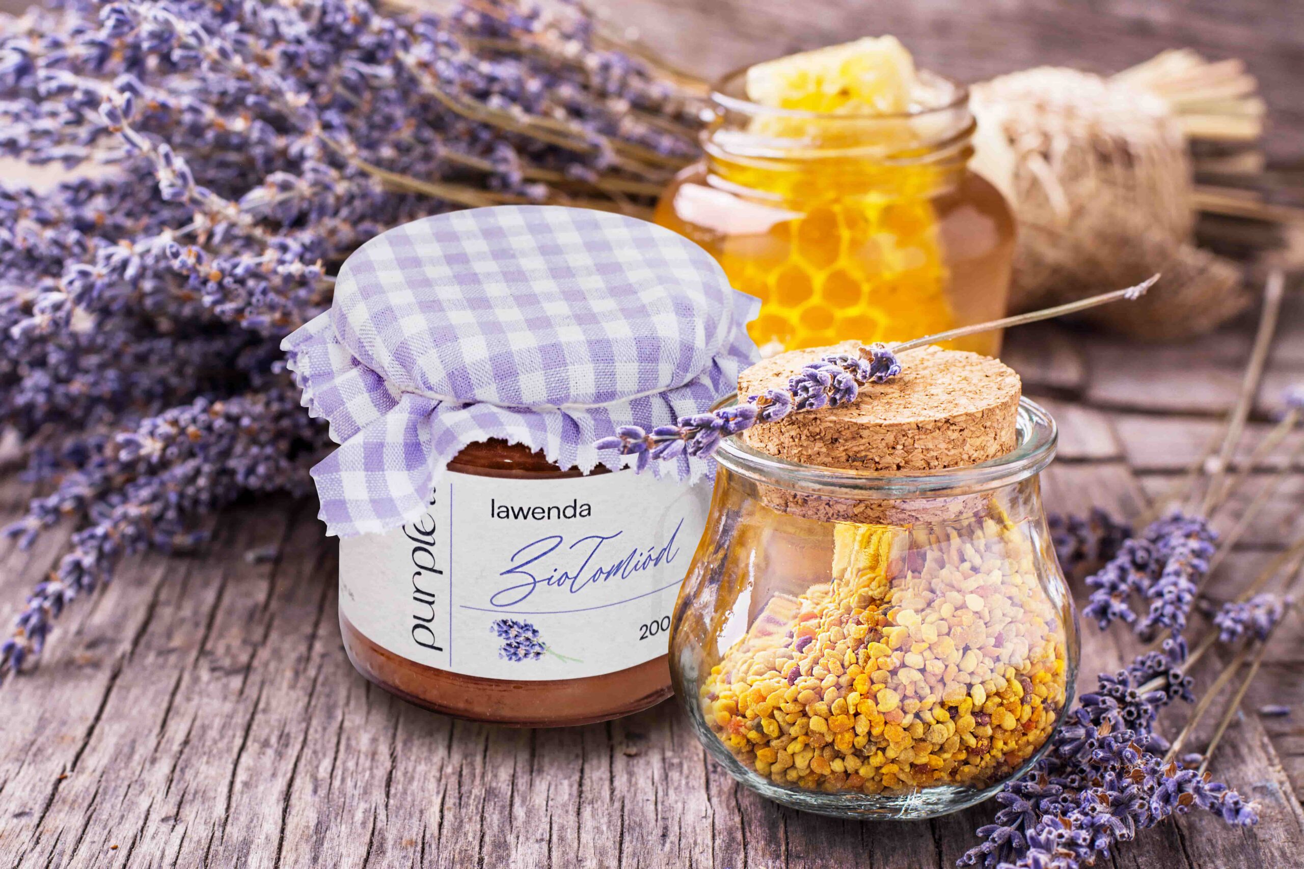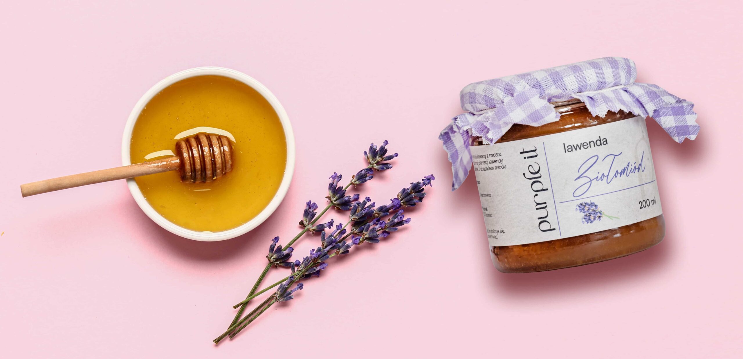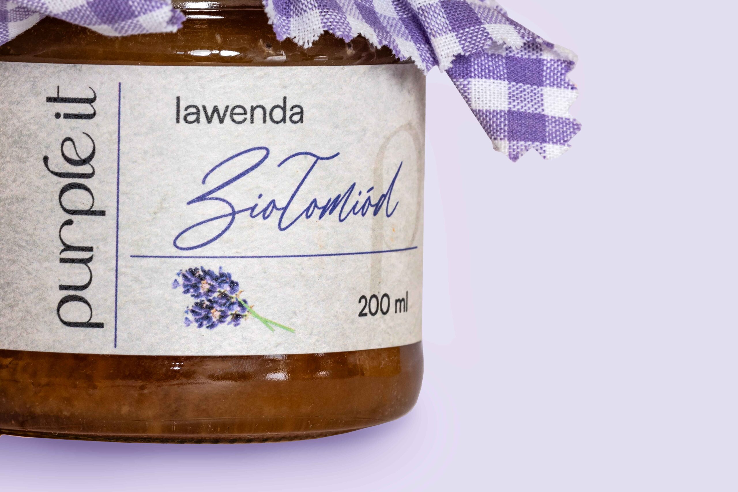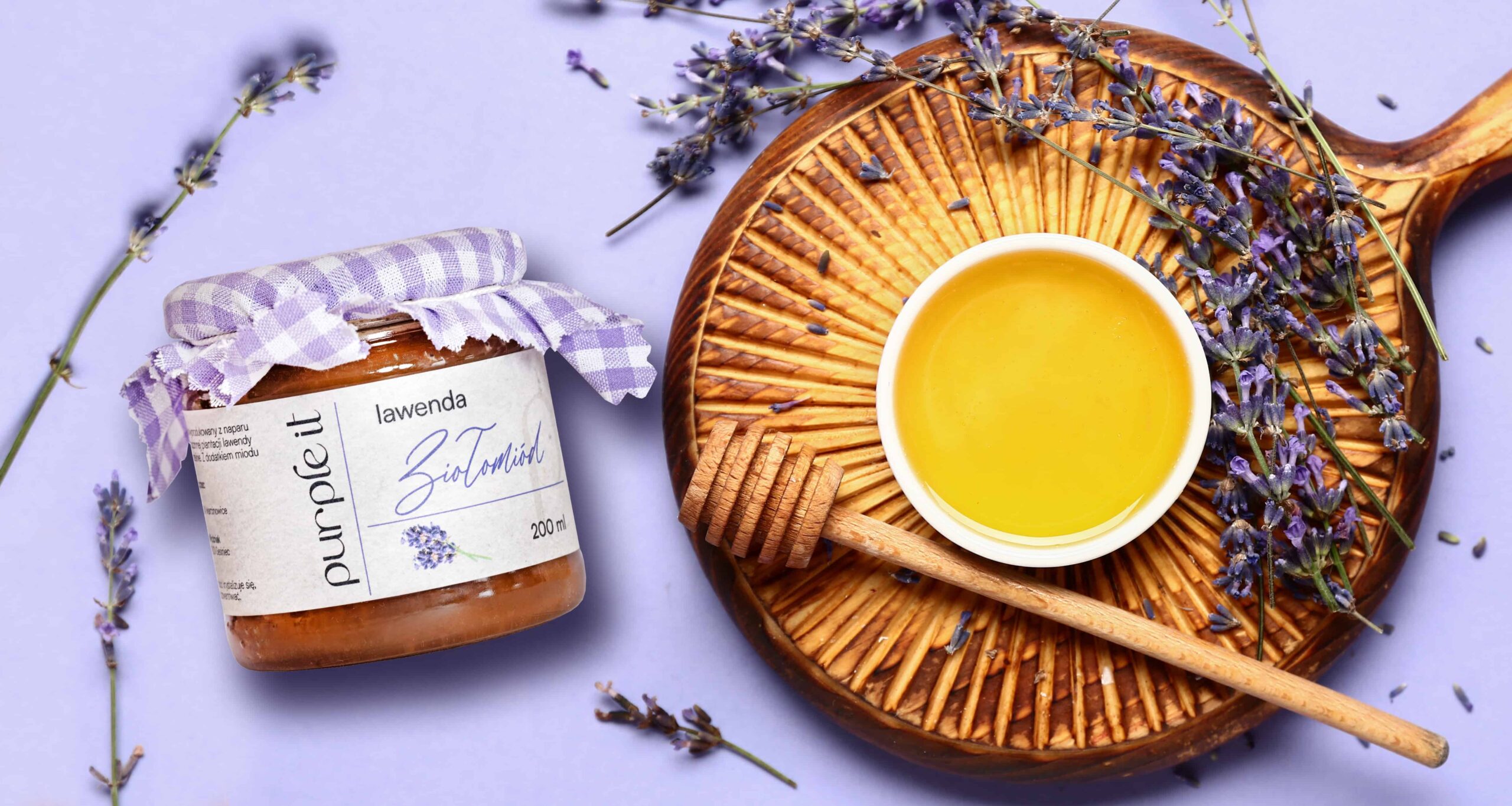
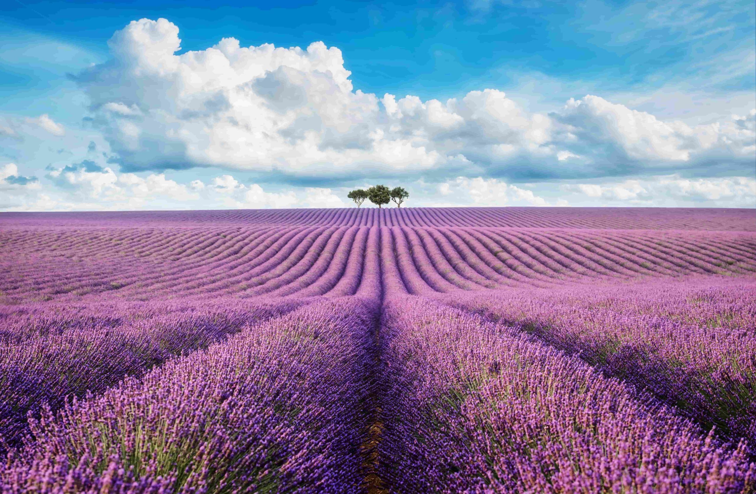
Our task was to design a label that harmonizes with a glass jar and a fabric cap, creating a cohesive packaging that evokes the delicate atmosphere of Provence. We drew inspiration from the beauty of lavender fields and the charming French style.
We proposed a design solution using handmade paper, reminiscent of vintage aesthetics that perfectly fit the Provencal style. The product name was crafted in an elegant, script font in a French style, emphasizing its exceptional character. Lavender graphics were delicately rendered with watercolor sketches, adding subtlety and feminine charm to the label. A modern touch was introduced with a minimalist font for “lavender” and a vertically placed logo, enriching the label with freshness and refined style.
To complete the package, the cap was concealed under a pastel fabric cover, giving the packaging a cozy, homemade feel.