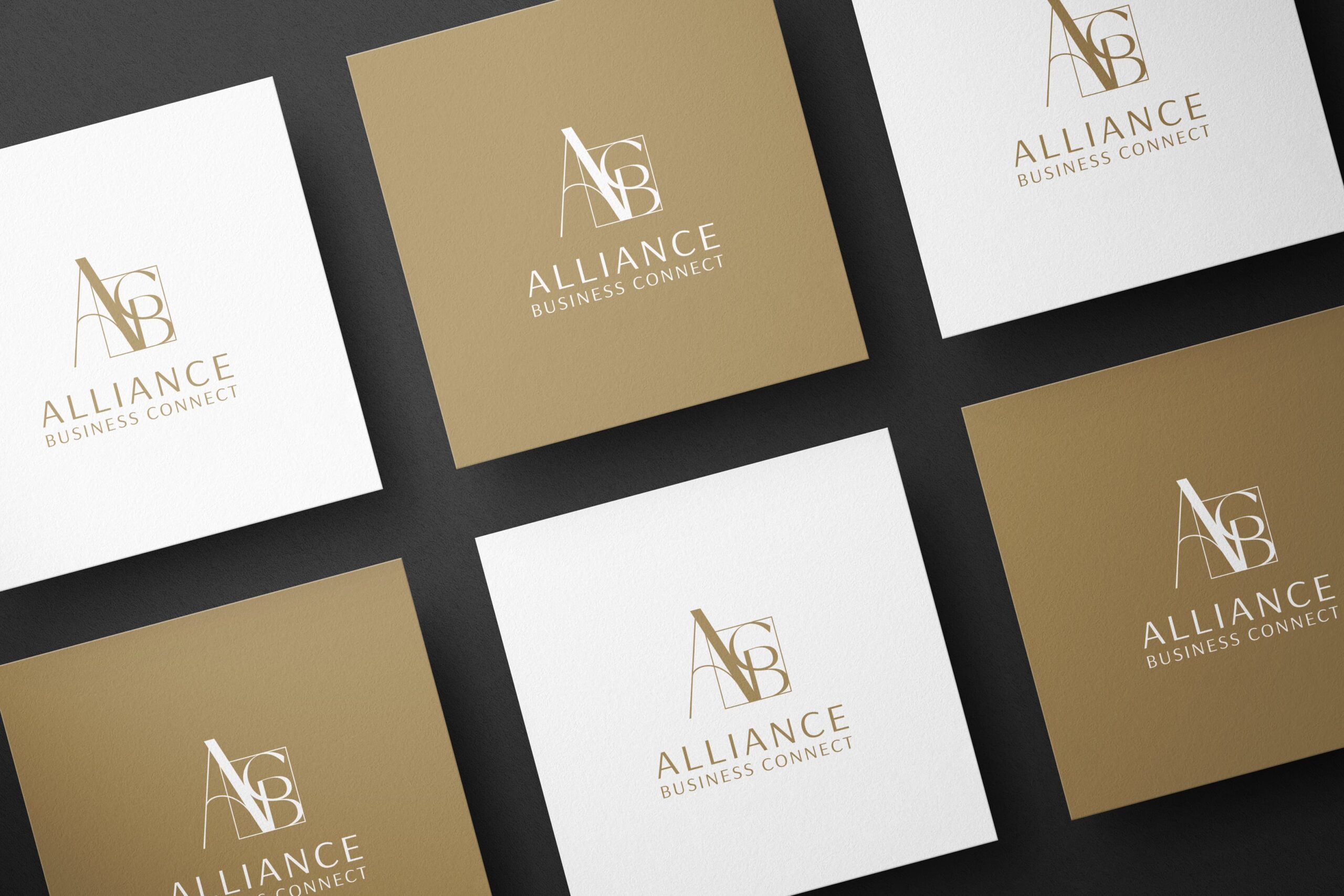
In wonderful collaboration with Katarzyna Woszczyna and her team, who approached us with the name and an almost complete vision for the identity, we designed a logo that embodies the values the organization stands for. From its inception, it was called the New Home
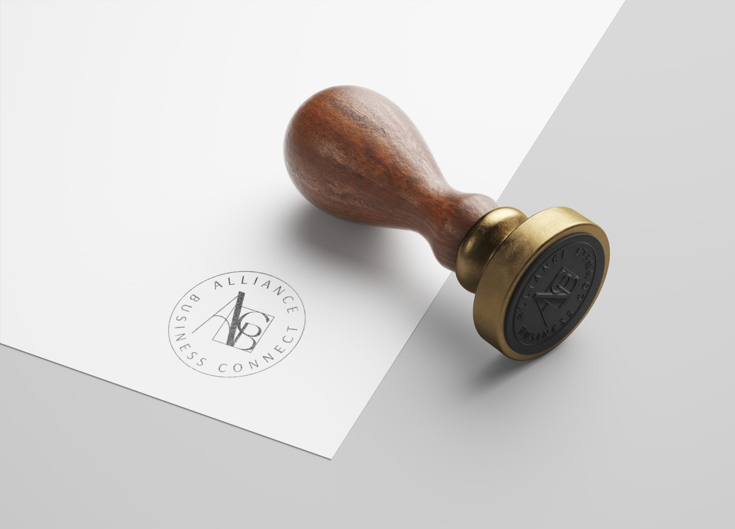
The emblem is a monogram composed of the first letters of the words forming the organization’s full name, enclosed in a graphic symbolizing a house. In the name Alliance Business Connect, the key word is “alliance,” which signifies a union. The foundation of ABC consists of the Founding Members, but the organization is open to new individuals and businesses, symbolized by the letter A extending beyond the boundaries of the “house.”
The gold color seen throughout the identity, unique to ABC, symbolizes light, the sun, and an excellent space, presented in a minimalist, modern, and elegant way. Clear lines and harmonious design symbolize a focus on clarity and efficiency. The subtle colors are not only aesthetic but also reflect values such as business ethics, purity of intentions, friendly cooperation, and transparency in business relationships. It is not just a graphic element; it is a visual expression of the approach to business.
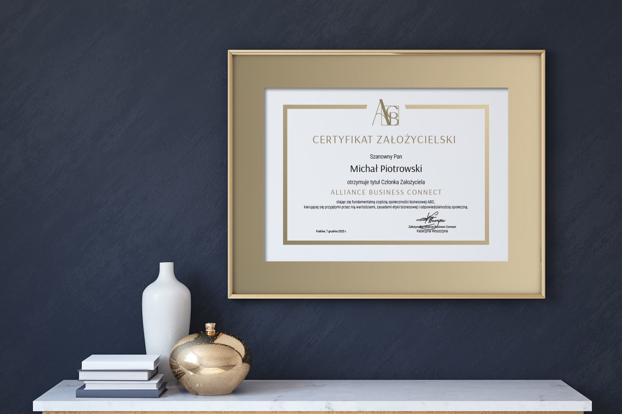
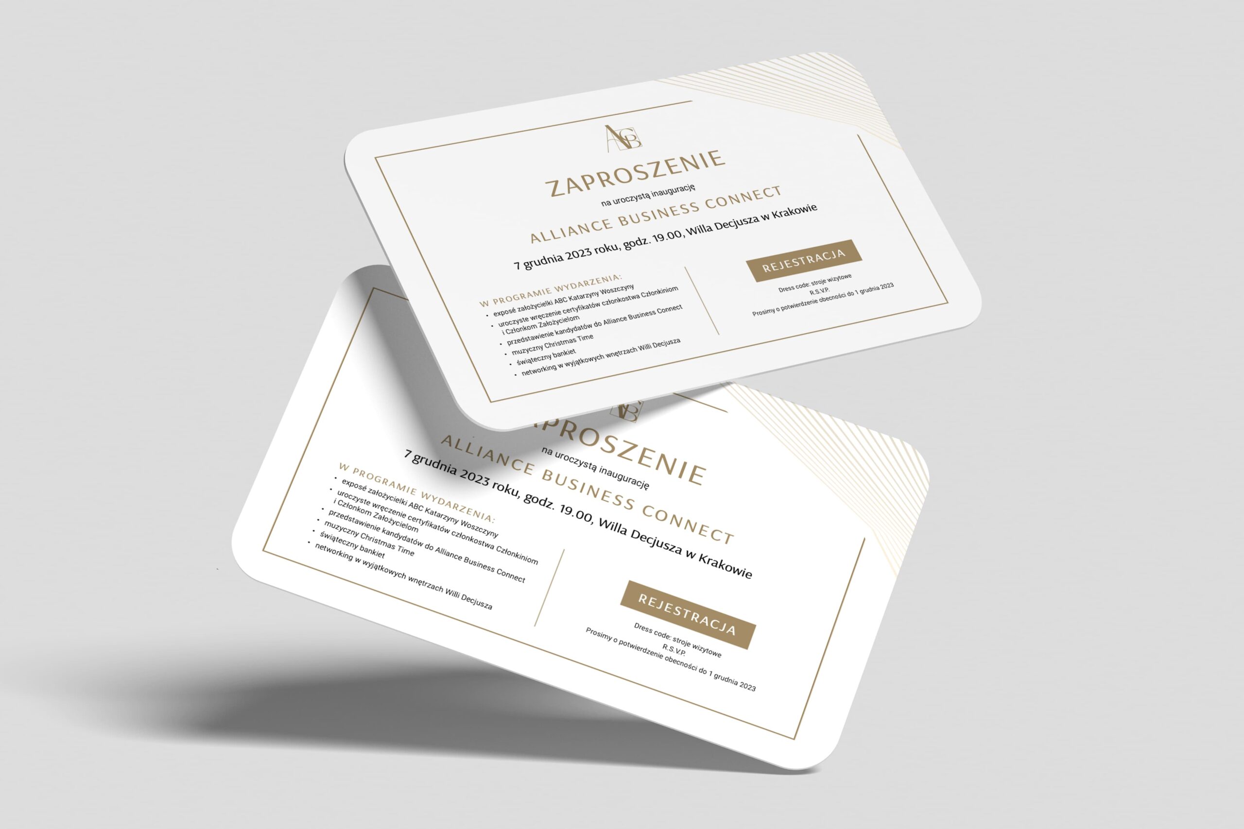
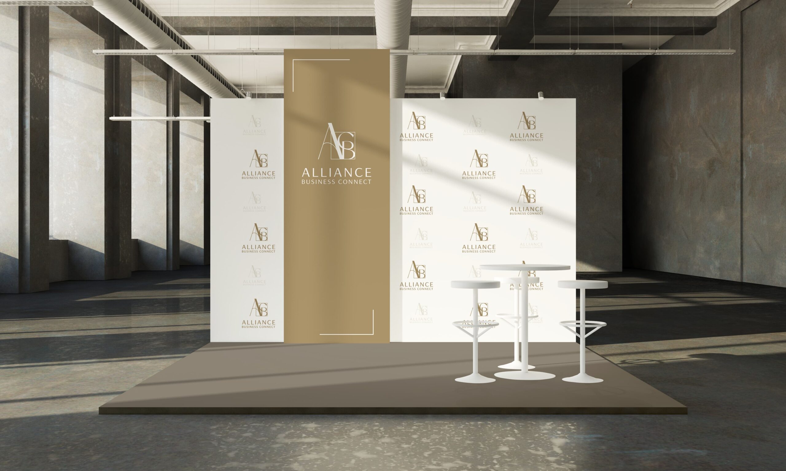
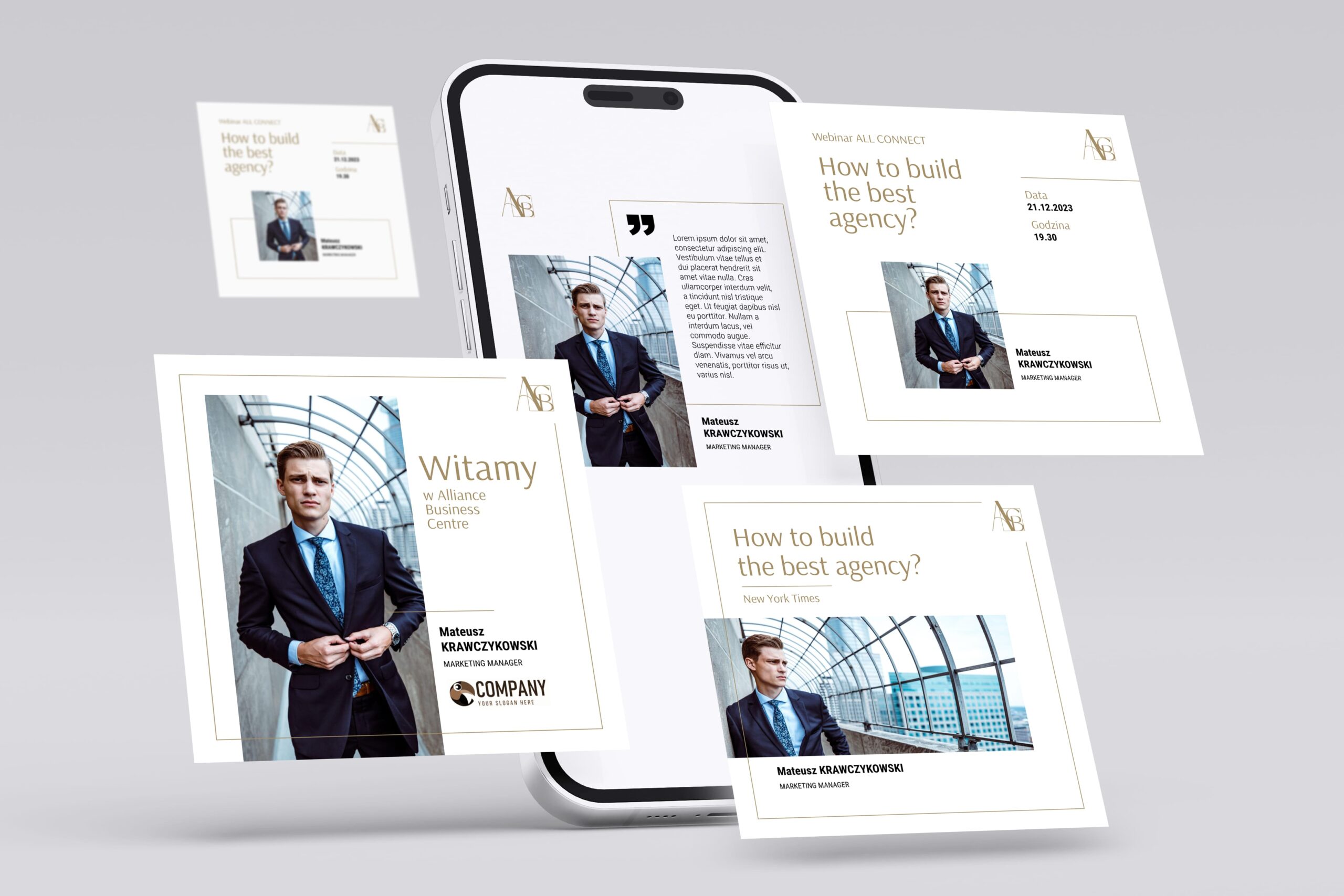
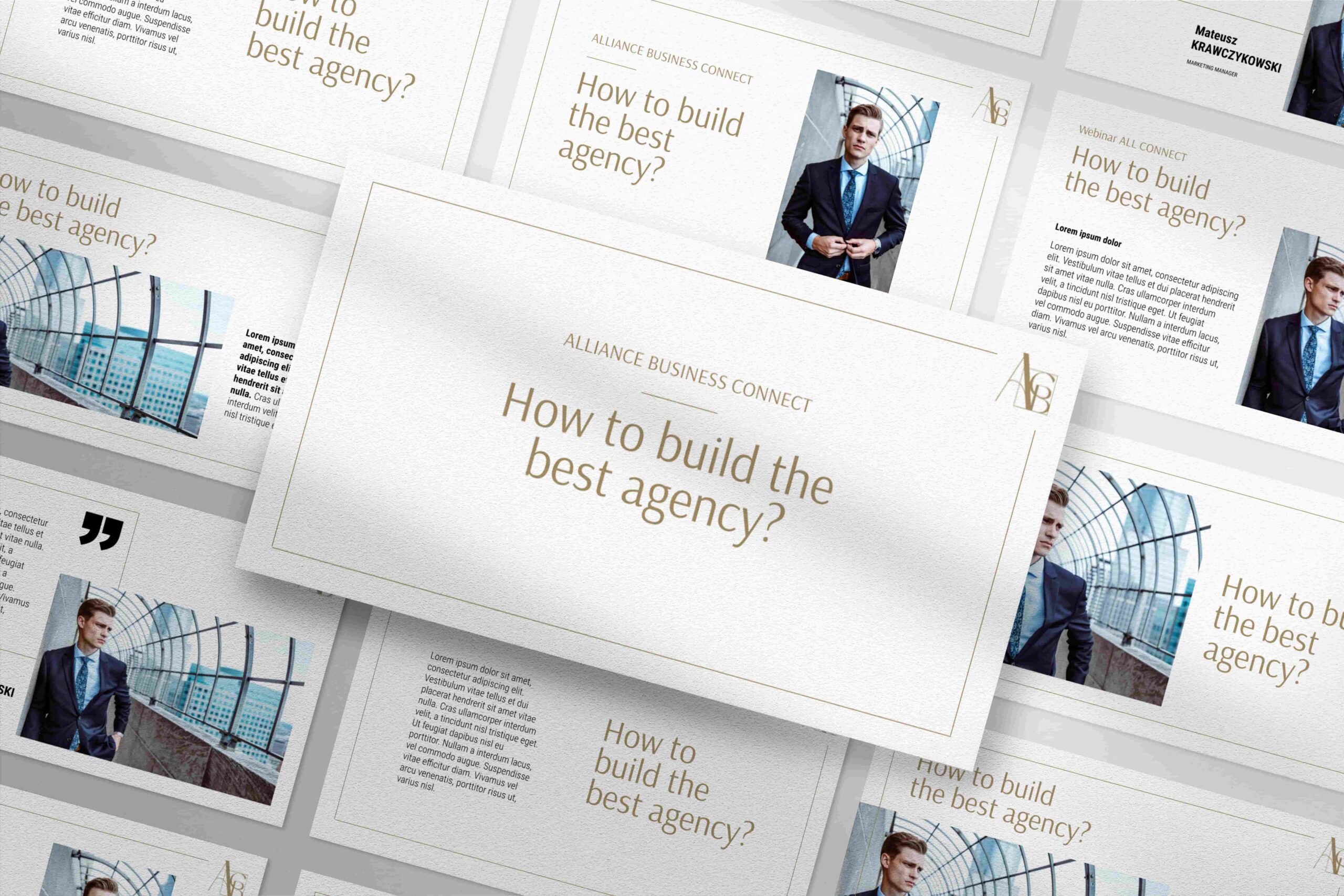
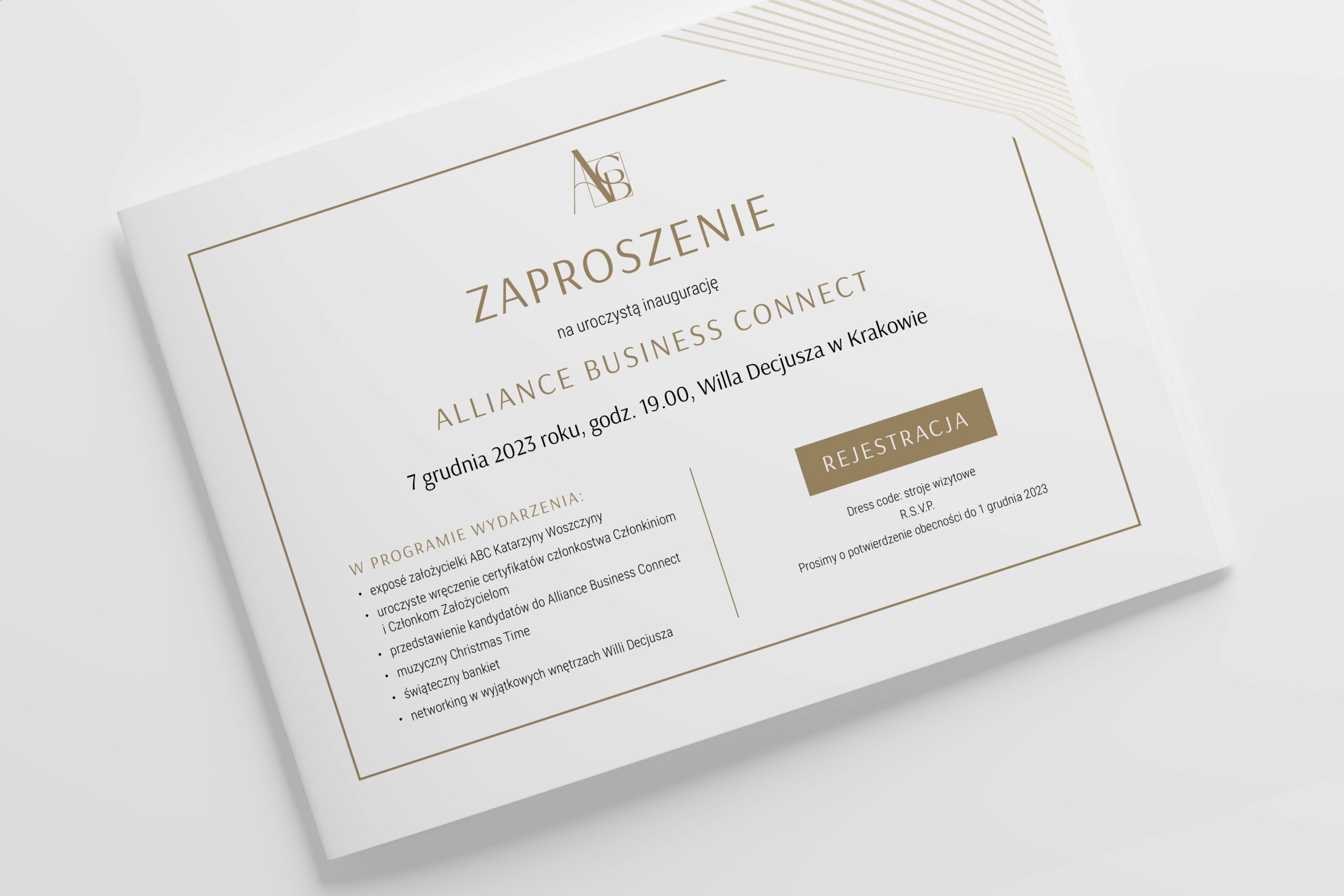
We also created a complete identity with a dedicated gold color in Pantone, a dedicated font, a Brand Book, a Key Visual setting the direction for promotional materials, the design of Membership and Ambassador Certificates, backdrops, and other formats including online layouts.