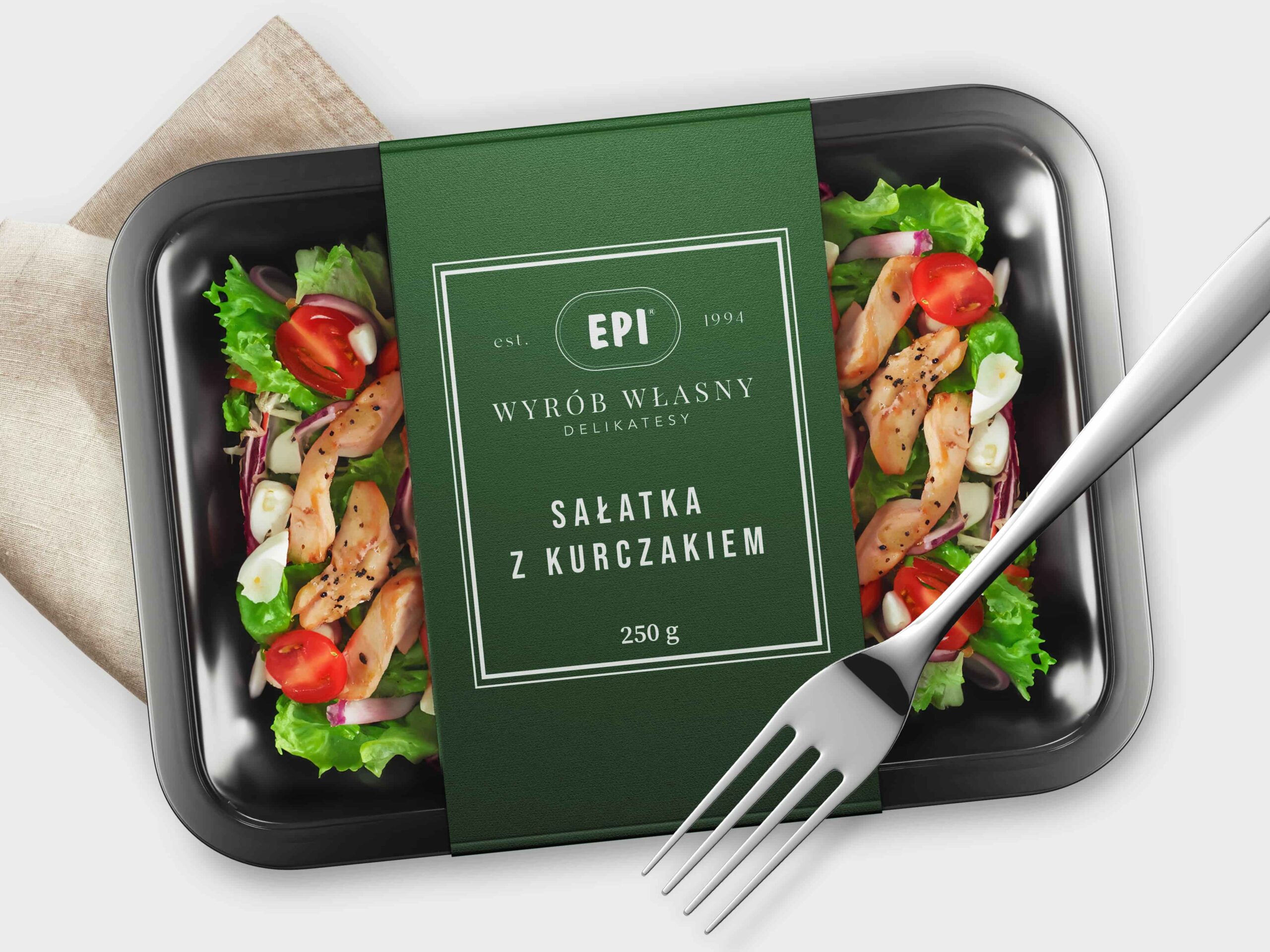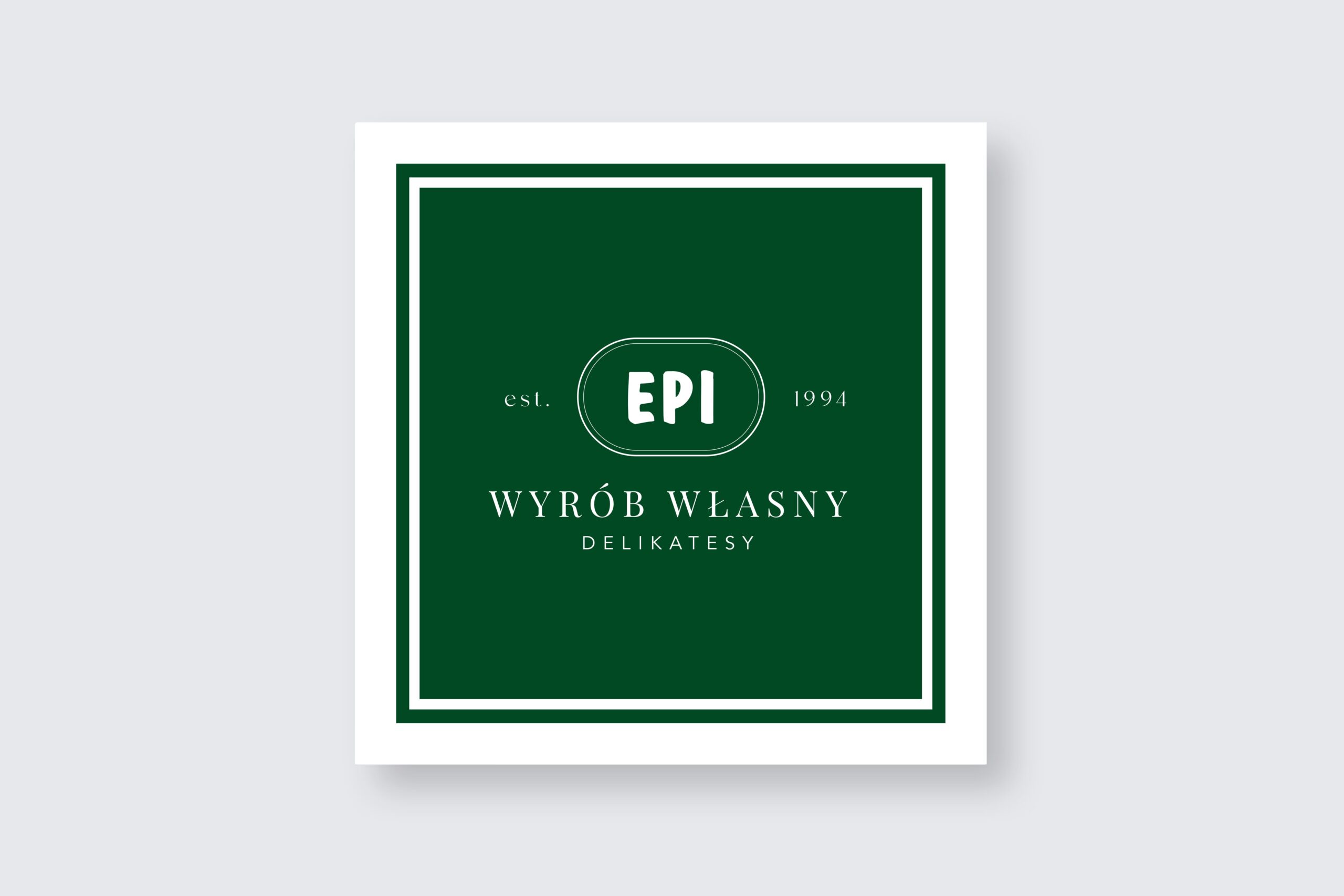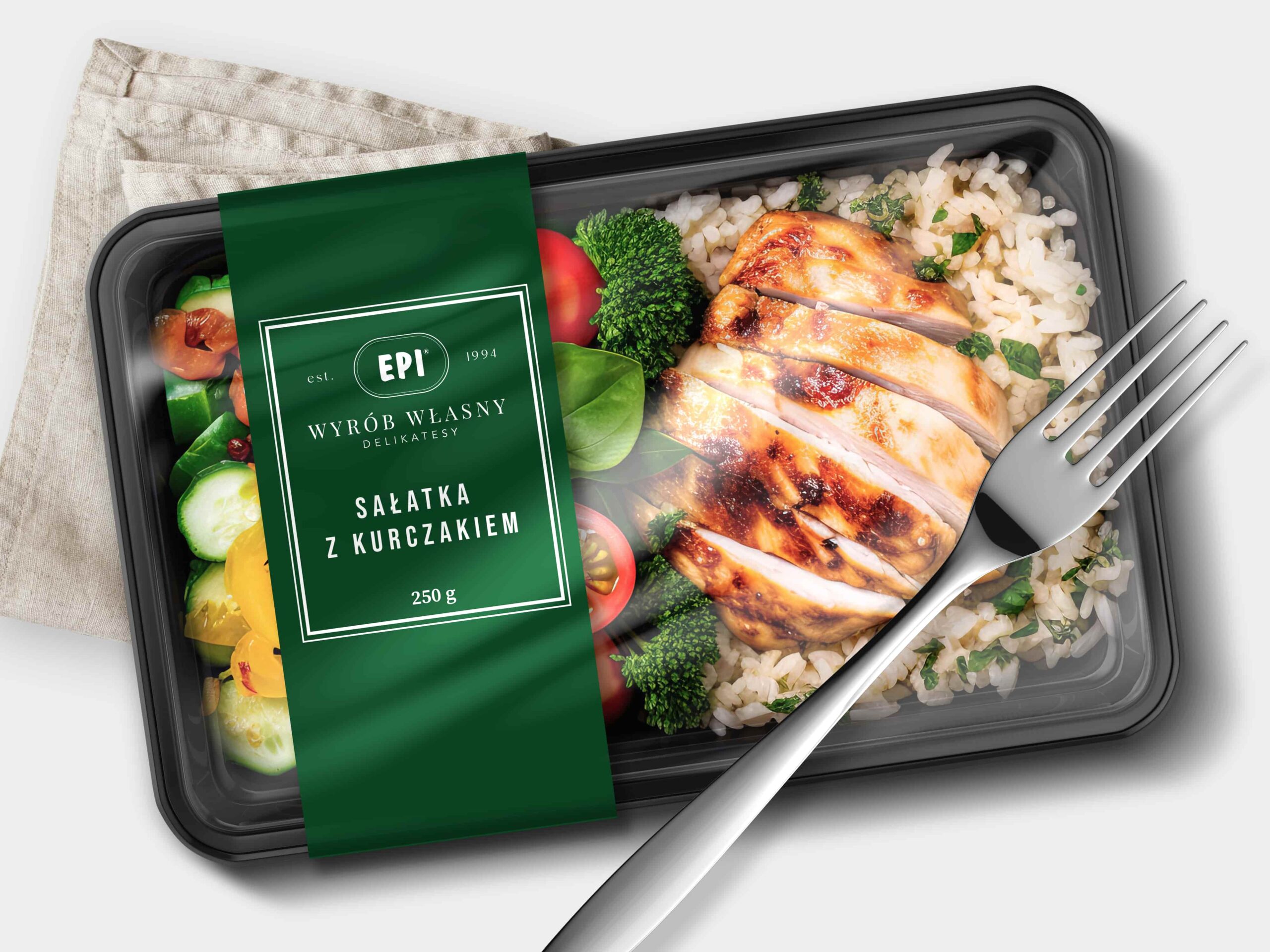
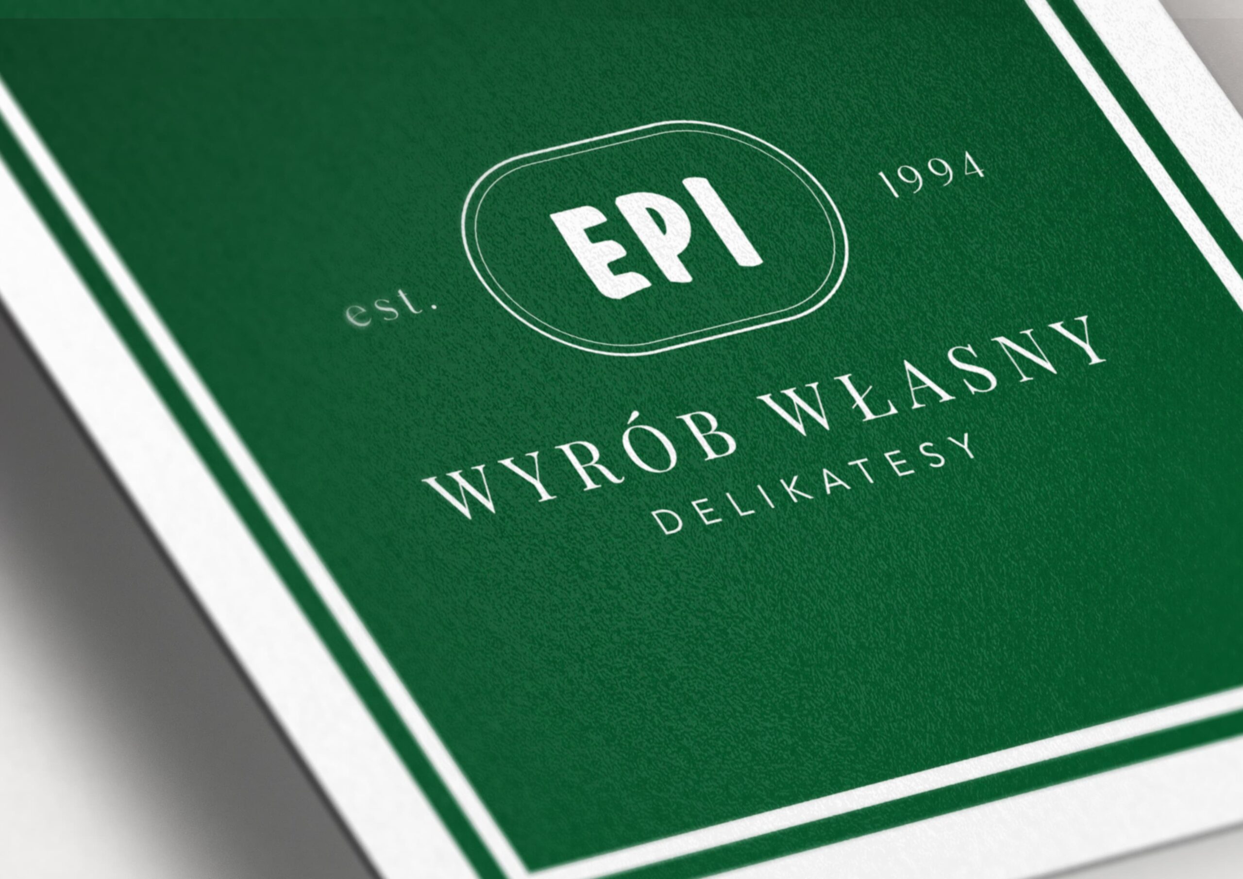
We began the project for the client with the creation of the “EPI House-Made Delicacies” icon, which was intended to set the direction for the new packaging design of their ready-to-eat convenience foods. The goal was to showcase premium quality and elegance tailored to discerning customers who appreciate high-quality packaging and products.
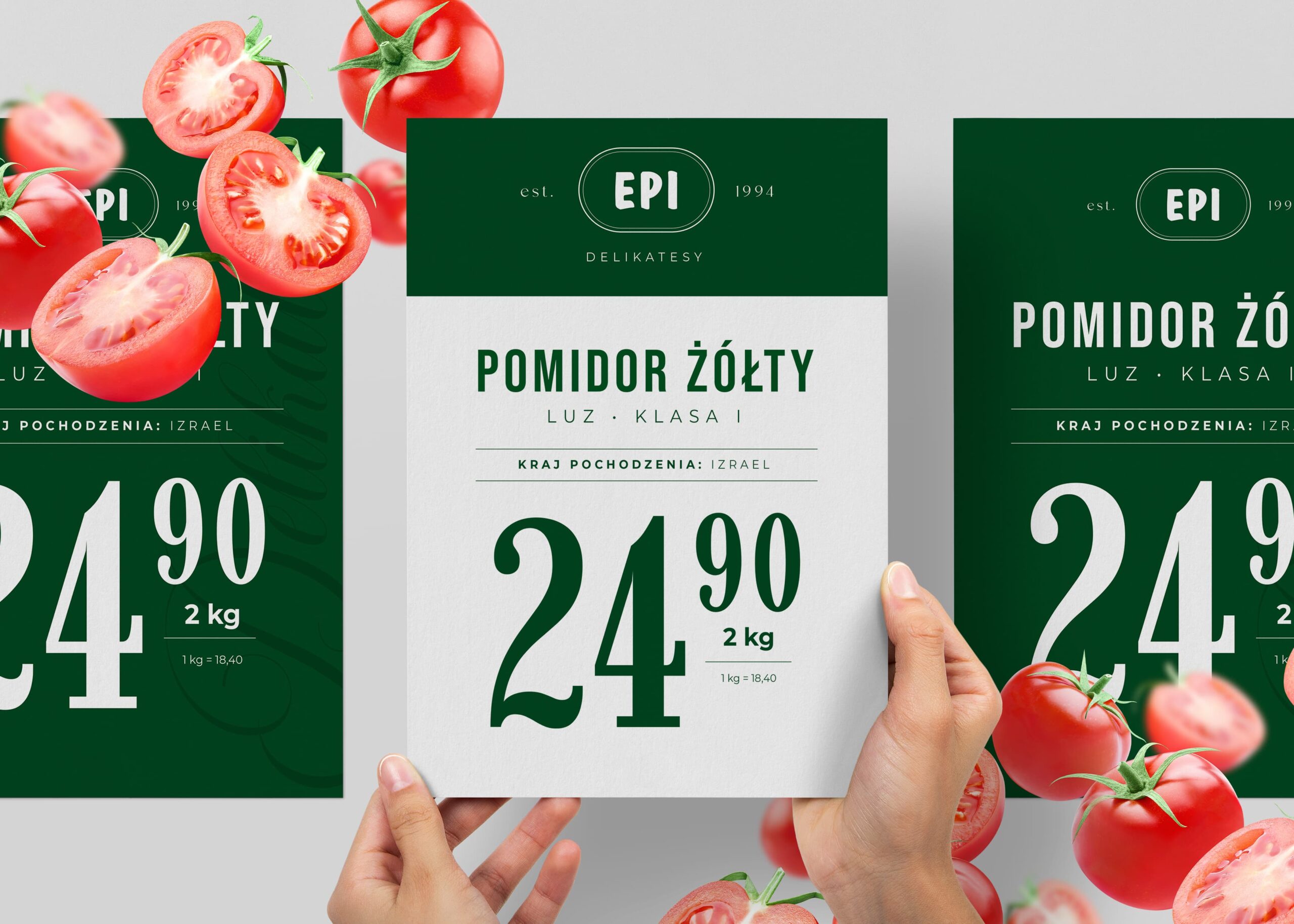
Based on the developed brand architecture, we sequentially created cohesive materials for each department within the market. Drawing inspiration from the history of EPI delicatessens, their target audience, and the unique needs of luxury products, we crafted a minimalist design with subtle classical accents that emphasize the brand’s elegance and uniqueness. The serif font in the icon adds a refined character, and the overall design is stylish, minimalist, with a touch of vintage flair.